


Have you ever asked yourself why bees build hexagons in their hives?
Simple: hexagons are useful shapes – using circles wouldn’t work too well as it would leave gaps in the honeycomb. The worker bees could use triangles or squares for storage but hexagons are structurally more stable and don’t leave any gaps. In other words: by using the right setup – hexagons – in their hives bees save a lot of time and energy that they can spend on their actual work.
They can get their job done. Strong – Minimum amount – best results – time saving – get shit done.
Do you recognize Stryber here? We hope so 😉
The logo construction was based in the golden radio using Fibonacci number sequence. The Golden Ratio is a mathematical principle that can be found in nature, anatomy, colour, and even sound waves.
Because of its pleasing nature, it has been used in art, paintings, architecture, music, and design over thousands of years. Scientific studies have shown that we perceive things that contain the Golden Ratio as beautiful, harmonious, and bordering perfection, even when we are unaware of it.

A responsive logo design means that the logo adapts to its environment. Adjust colors, sizes and details.
Whenever possible, we should use our main version but In different contexts we tend to prioritise different aspects of our brand, due to technical or communicational priorities.
Design execptions not stated here; please ask for permission if you are uncertain and use the examples here as guidelines.


Hex: #1C1C1C
RGB: 28, 28, 28
CMYK: 0, 0, 100, 89

Hex: #FFFFFF
RGB: 255, 255, 255
CMYK: 0, 0, 100, 0

Hex: #1FAD8B
RGB: 31, 173, 139
CMYK: 82, 0, 20, 32

Hex: #2878FA
RGB: 40, 120, 250
CMYK: 84, 52, 100, 2
To keep our brand system consistent we chose the Galano grotesque family as the Stryber main typography.

For web accesibility we use Open Sans as our go-to text font in the situations where Galano cannot be implemented

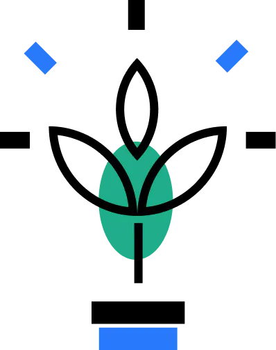
Our illustration style builds off the simple shapes of our logo and the transportation language background of our typeface. Simple shapes, clean lines, limited color our illustration a branded feel and make it easy to digest and understand at a glance.